We are finally in a place where we can begin to see some recurring patterns in our discussion of the Lego model of the Willis Tower. We might ask what do the following have in common?
a) The address of the Willis Tower: 233 S Wacker Dr, Chicago, IL 60606, USA
b) The hierarchy of materials from which the Lego model is made: Lego brick, plastic, chemicals, molecules, atoms, sub-atomic particles
c) The location of my socks: my house, first floor, back bedroom, chest of drawers, top, left hand draw
d) The key to the diagram below: colour, node, brick, level, stage, building
e) The typographic hierarchy in a book: book title, chapter title, subheading, text, caption
There would seem to be some basic conceptual structure or hierarchy that underlies all of these examples. We might move from top to bottom (b, c, e) or from bottom to top (a, d), but either way there seems to be a structure in which, like Russian dolls, one thing is contained in another. As we have seen, this is a slot/filler structure in which a slot is filled in by the next lowest entity in the hierarchy. And this filler then can become a slot for the next lowest thing, and so on.
Let’s take the address of the Willis Tower as an example. An address is made up of parts, and as with many US addresses there is a familiar structure: street number, street, city, state, zip code, country. These elements that make up this address structure are relatively fixed. Yes we might identify a property with a name rather than a number, or perhaps include an extra line in the address to identify an apartment, and different countries might do things differently, but on the whole there are not that many variants to this structure. The elements are also hierarchical where the ‘country’ element identifies the largest area which steps down to ‘street number’ that identifies the smallest area. Then each of these categories can be understood as slots that themselves, can be filled in:
Street number: 233
Street: South Wacker Drive
City: Chicago
State: Illinois
Country: USA
To someone from the UK there is a refreshing logic to addresses in Chicago in that the city is based on a grid system. Consequently South Wacker Drive is ‘South’ because it is south of Madison Street. But let’s ignore the complexity of this logic and also that of the zip code which are both things particular to the USA. So just looking at the five address lines above, there is a country slot that can be filled in with USA, a state a slot that can be ‘filled in’ with Illinois, a city slot which that can be filled in with South Wacker Drive, and so on. Each of these slots has the potential to be filled in by different numbers of fillers. The ‘country’ slot, for example, can be filled-in with the name of any of 195 countries, each country having its own unique designation. The ‘state’ slot can be filled in with the name of any of 50 states. By the time we get to the ‘city’ slot though a new problem arises. There is the duplication of names in different countries; there is a Cambridge in the UK and a Cambridge in the USA, a Paris in France and a Paris in Texas. Similarly in relation to ‘Street number’ there are a range of numbers possible, but without knowing this range of numbers we might imagine any number, and these numbers are replicated in streets all over the world. The specificity of the ‘city’, ‘street’, and ‘street number’ fillers all depend therefore on them being a part of larger structure or frame. The relationships between the slots in the address are mereological; streets are part of a city which are parts of a state and so forth. The relationship of the fillers to the slots however is taxonomic; ‘South Wacker Drive’ is a member of the category of ‘streets’.
So why is this of interest to a graphic designer? Well imagine I set out the address like this:
233
South Wacker Drive
Chicago
Illinois
USA
This makes the most important thing the number of the building, it is as if we are standing right outside of the Willis Tower and are being confronted by this huge edifice, yes we might be in the USA but this is probably not as relevant to this experience as the street number right in front of us.
But I am not standing in front of the Willis Tower I am sitting at my desk, at home in the outskirts of London. So to help me (and maybe the postal service) find the Willis Tower it might be better to first emphasise the country where it may be found, as below:
233
South Wacker Drive
Chicago
Illinois
USA
The point here is that there is no right way to code the address typographically. As designers though we might provide a visual structure that alerts the reader to the existence of an underlying conceptual slot/filler structure. We can do this by using a bold, regular, or light font for example. And recognising a correspondence between visual structure and conceptual structure helps the user to make sense of the different parts of the address. Similarly the ways that words are structured through grammar can evoke conceptual slot/filler structure. Though we need to bear in mind here that words are not concepts, and although we often conflate the two, words are strictly labels for concepts, and we use many more concepts than there are words to label them.
Once this conceptual slot/filler structure has been highlighted visually, the user might then infer numerous things based on this structure and the information of which it is made. In addition to size, as designers we have a range of tools at our disposal that we can use to establish a visual structure: from bold to light for example or simply using placement with lines placed in a certain order.
That slot/filler structures are so common would seem to indicate that this might be to do with how we think, and the neural architecture involved in this activity. As mentioned previously the idea of slots and fillers is borrowed from Frame Theory, and this theory is far more complex than there is space to discuss here and I hope to explore this in greater detail in other essays. But cognitive scientists would recognise theories around combinatorial, recursive structures, frames and sub-frames, and issues to do with the binding, and unbinding of concepts. As a designer I have not until fairly recently, been aware of these ideas, but I have, throughout my career, attempted intuitively, to provide visual prompts for these nested slot/filler structures in the layouts and diagrams I have designed. Once again, these visual prompts are not fixed rules that have to be followed but are flexible and dynamic, and can be creatively established by the designer.
To illustrate how visual cues can be provided that evoke slot/filler structures it is probably worth looking at a couple of examples.
Imagine a book based on this website. One of the first jobs of the designer might be to work out the structure of the text; what is text, what are subheadings, and so forth. Interestingly the structure of the resulting book corresponds closely to the structure we found in the address of the Willis Tower. There is a similar slot/filler structure as can be seen from the table below.
| Address A1: Slots | A2: Fillers | Book B1: Slots | B2: Fillers |
| Street number | 233 | Text | Traditional metaphysics is that part… |
| Street | South Wacker Drive | Subheading B | Mereology and the metaphysics of bits and pieces |
| City | Chicago | Subheading A | Parts and Wholes II |
| State | Illinois | Chapter title | Lego |
| Country | USA | Book title | Hylomorphic |
Looking only at the column of fillers in the book portion of table (B2), we might reflect on these and come to a conclusion about how they might form a hierarchical structure. But this reasoning is much more obvious if we also look at the slot column of the table (B1). These slots evoke much more clearly a hierarchy linked to parts and wholes. We can say therefore that the filler column inherits some of this hierarchical structure from the related slot structure. In an actual book, we might imagine explicitly naming these slot labels in the design. For example we could include the slot label in the typography on the cover, as in ‘Book Title: Hylomorphic‘. Instead though we tend to use the visual/typographic layer to label this information. The style pages produced by the designer of our imaginary ‘Hylomorphic’ book establishes a way of visually labelling the slot structure to show how it will recur across the whole publication. The slot label is not explicitly presented on the cover in words but this can be inferred from the visual presentation of the information.
The image below shows two fairly conventional layouts, the page on the left shows an arrangement for a chapter opening of a book, the page on the right shows a conventional arrangement for an advertisement. Both presentations are schematic there is no ‘content’ in terms of the words that would actually appear—these are represented with placeholder text that shows the visual/typographic styling and structuring alone. What hopefully emerges is that the slot structure of a stereotypical book is reasonably clear: we can infer what is the chapter title, sub-heading a, sub-heading b, text, long quote, pull-quote, and folio number. With regard to the right-hand image, we typically associate a different set of slots with advertisements, so the layout on the right hopefully evokes such slots as: headline, call-to-action, copy, signature.
Purely typographic advertisements are not unheard of, but more commonly we might expect to see an image of some kind, and this would make the page on the right even more recognisable as an advertisement. The point here though is that once we have identified the appropriate frame/genre—is it a book, advert, address, poster, web-page, or something else—we can then use the visual styling/structure to infer which elements relate to which slots. If it is a book the large bold type suggests a chapter title slot, if it is an advertisement the large bold type suggests a headline slot. And this is important because a chapter title is different to a headline. Typically, we might expect a headline in an advertisement to make a claim about why I might buy something, or why I should act in a certain way. A claim which may then be supported by arguments in the advertisement’s copy. Conversely, we might expect a typical chapter title in a book to designate a topic which is then described or explored in more detail in the text. These differences are not trivial.
Thankfully all this is not something that we need to consciously work out, all this reasoning happens pretty much automatically, at the edges of our conscious awareness. And there is a great deal of integration at work here. For example, the title of our book is just one word set in bold, Hylomorphic, but it allows us to recognise the subject of the book, and to infer the place of this title in a hierarchical structure. The one-word title is an access point to visual, written and conceptual structure which supports us in our endeavour to make meaning.
Along with others, I would argue that what this does not mean, is that as designers we have always to follow these conventional patterns of layout. We might choose, for example, to produce a book layout in a much more unconventional way; according to different approaches to visual styling, but which, with a bit more effort perhaps on the part of the reader, might also have patterns of visual emphasis that evoke the same slot structure of chapter title, sub-heading, text and so forth. Messing with a conventional visual rendition of this conceptual structure might seem like an indulgence on the part of the designer. Why make things more challenging for the reader? But in appropriate situations it can be enjoyable to resolve the structure evoked by an experimental layout, and furthermore, perhaps such experiences expand the visual literacy of the user.
There is so much more to be said about this, but inevitably I am running out of space within the limits of what I have called an ‘essay’. Before finishing the essay however there is one more point to make. The examples above have focused on typographic styling and how this can be used to evoke conceptual structure. Typographic styling is, however, only one strand of the visual styling available to designers, and other visual approaches too can evoke slot/filler conceptual structures. So to finish, let’s return to one final rendition of the Willis Tower Lego model.
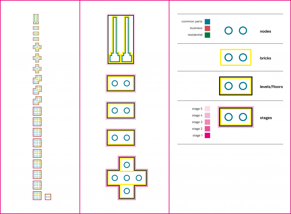
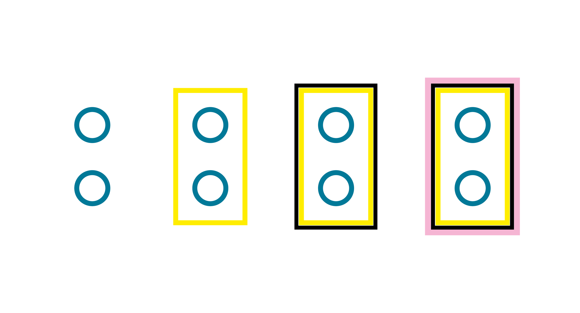
The diagram above shows a diagram based on one of the photographs in an earlier section of the essay. The left panel shows a diagram of the whole tower, the central panel is a detail of this diagram, and the right panel is a key showing how the diagram is structured. The first row of the key shows how the nodes of the Lego bricks are represented. Each node can be coloured differently in one of three ways according to how we might envisage this area of model being set aside for either business, residential or common parts/services. The next row of the key shows how the yellow rectangle identifies the size of Lego brick used, the size of bricks used in the model can range from accommodating one node, to six nodes. The next row in the key uses a black outline to show how bricks can combine to form levels in the building, in the key there is just one brick on this level but a level could be made from multiple bricks. The final row in the key uses a magenta outline to show the stages in the tower. For example levels one to nine share the same layout of bricks and these nine floors make up stage one of the model. Altogether there are five stages in the tower so the magenta outline in the key has five different tints of magenta that can be utilised, one tint for each stage in the tower.
The point I am trying to make with this diagram is that there are slots—nodes, bricks, levels, stages—that can be filled in differently, and this conceptual structure is evoked visually rather than through verbal language. Admittedly words are used in the key, but the logic of the visual part of the diagram uses containment. Here ‘stages’ are designated with the outermost outline, nested inside that outline is the black levels outline, then the yellow brick outline, then the innermost circular nodes. It uses the same logic as the Russian dolls toy we discussed earlier. Furthermore, two of the slots in the key, the ‘stages’ and ‘nodes’ slots, have their own internal nested structure so that each slot has a more granular level with further options in terms of the colours that are used to render them.
In some ways all of this seems incredibly obvious and barely worth talking about, and this is because of all of the cognitive work that goes on in the background. But consider for a moment the chains of reasoning evoked by the diagram and the incredible amount of integration it involves. The diagram above references a photograph of an arrangement of bricks that represent a model. This photograph represents a three dimensional model with 19 levels, and this model in turn represents a huge building of some 108 floors, made out of completely different materials. The representations of the model highlight things about the model but also potentially things about the actual tower too. Consequently, the diagram does not have one focused fixed meaning, rather it is an access point to a whole range of potential meanings that we do not activate all at once. Instead, we can imagine our attention moving across possible meanings and resolving what is relevant and of interest to us.
For graphic designers one of the first considerations is often to establish a visual hierarchy but as we have seen this can involve more than simply choosing a range of different type weights that correspond to a range of different levels of information. A visual hierarchy can be established in a number of ways, and in essence is a mapping between a system of visual forms, and a conceptual structure. The manipulation of visual form leads to different calls on attention. If something stands out visually, it typically registers as something that is more salient/important conceptually.
In this discussion centred on how a building is represented by a model, and how a model can be represented graphically, I have tried to suggest ways in which our thinking might be sharpened by thinking about parts and wholes and slots and fillers. Consideration of what parts make-up wholes, and which fillers fit with which slots can help us to find appropriate imagery/ideas that align with our communicative aims. Furthermore, these images can work in conventional ways, where a part is metonymically related to the whole—where a brick is a part of a building, for example. And the link between the part and whole can also be more creative/unconventional too, where a part is metaphorically linked to a whole—such as, a Facebook profile picture forming part of a siphonophore.
Conversely, as designers we might turn this around 180° and think about which structures using slots and wholes can make sense of the range of information that we need to structure and present.
Phil Jones, 2025